Feng Shui Small Apartment: One 48 m² Flat, Three Layouts
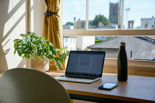
Option C, bed and desk side: bed on the short solid wall, desk beside the window on side light, low shelf at the foot of the bed. The sofa and entrance boundary are in the next view. Photograph; the plan is exact, the room is a composite.
A forty-eight square metre studio, one window in the living space, a galley kitchen along the side wall, and a front door that opens straight into the room. Two people, both working from home two days a week. The question is not “what is the feng shui of this apartment.” The question is where the desk goes.
This is a design exercise worked with feng shui criteria. The proportions are drawn to scale; the apartment is a composite. The point is not to produce a universal rule for every small flat. It is to show how a feng shui small apartment decision is actually made: by naming the constraints, testing a few arrangements, and accepting a trade-off.
What this case study covers
- The brief
- The constraints
- Option A: desk in the window
- Option B: desk in the alcove
- Option C: desk beside the window
- Comparison table
- Decision matrix
- Why C works in the tradition’s terms
- What was not done
- Conclusion
The brief
The flat is eight metres by six. The front door is at the bottom left and swings inward along the left wall. The kitchen run is along the left wall and cannot move; it is plumbing and gas. The only window in the living space is at the top wall, facing a courtyard, so the light is soft and never direct. The bathroom is at the bottom right.
Two people live here. Both work from home two days a week. That means two workable positions matter more than one excellent one. It also means the desk cannot be treated as a temporary object that gets folded away at the end of the day. It has to have a place.

The same 8 × 6 m flat in three arrangements. A takes the window and pinches the route; B clears the route and leaves the desk in the dark; C keeps the bed on the solid wall and gives the desk side light.
The constraints
Three things cannot move: the door, the kitchen run and the window. The door determines the route. The kitchen determines the work zone. The window determines the daylight. Everything else is a choice.
That leaves three decisions: where the bed sits, where the desk sits, and where the entrance stops being a corridor. In a feng shui small apartment, those three decisions are connected. Move the bed and the desk changes. Move the desk and the route changes. Move the sofa and the entrance changes.
The constraints are also a useful corrective to the fantasy of the perfect layout. There is no arrangement that gives the best light to the desk, the best wall to the bed, the clearest route and a defined entrance at the same time. There is only an arrangement that accepts the right trade-off for this household.
Option A: desk in the window
The obvious arrangement, and the one most people try first. The desk goes in the window because the window has the best light. The bed goes in the middle of the floor to divide sleeping from sitting. The sofa stays against the right wall, facing the television wall.
| Criterion | Result |
|---|---|
| Daylight for work | Excellent |
| Door swing | Blocked; the chair sits in the arc |
| Walking route | Interrupted between door and kitchen |
| Sleep position | Head under the window |
| Work position | Good, until someone needs to walk past |
The problem is not the desk. The desk is in the best place in the room. The problem is that the bed then goes in the middle of the floor to divide sleeping from sitting, and the gap between the bed and the kitchen run closes to about 45 cm. That is the classic trade in a small flat: the best light and the worst circulation are the same square metre.

Option A: the desk takes the best light, the bed splits the floor, and the gap to the kitchen closes to about 45 cm. Illustrative; the plan is exact.
Option B: desk in the alcove
Swap them. The bed goes against the short wall beside the bathroom, the desk goes into the alcove next to the kitchen, and the door swing clears.
This is better. The bed has a solid wall behind it, the door is visible from the pillow, and nothing is standing in the swing. The route from the door to the kitchen and the window is clear. The flat feels larger because the middle of the floor is no longer occupied by a bed.
The cost is daylight. The alcove is a metre and a half from the window and gets none of it directly, so the desk needs its own lamp and the work happens in a pool of warm light against a dim room. For some people that is fine. For two people working from home on the same days, one of them will be sitting in the dark.

Option B: bed on the solid wall, door in view, desk in the dim alcove with its own lamp. Better circulation, worse daylight. Illustrative; the plan is exact.
Option C: desk beside the window
The arrangement that was chosen, and the least obvious of the three.
The bed stays against the short wall — head to a solid wall, door in view, window to one side rather than behind the head. The desk moves off the window to the wall beside it, so the light falls along the work surface from one end instead of from behind the screen.
The sofa turns ninety degrees to face the entrance rather than the television wall, which creates a boundary at the door without building one. A low shelf, 80 cm tall, sits at the end of that turn and does the work of a wall. The window keeps a chair and a plant, and stops being an office.

Option C in the room: the sofa turned to face the entrance, a low shelf at its back doing the work of a wall, and the desk on side light rather than in the window. Illustrative; the plan is exact.
The chosen layout is a compromise, but it is a compromise with a clear logic. The bed gets the solid wall. The desk gets side light and a usable surface. The sofa gives the entrance an edge. The route from door to kitchen, window and bathroom stays around 90 cm. Nobody has to turn sideways carrying a pan.

The trade: side light along the desk rather than a window view. Usable all day, and nobody has to walk past the chair.
Comparison table
| Criterion | Option A | Option B | Option C |
|---|---|---|---|
| Daylight for work | Best | Poor in the alcove | Good side light |
| Door swing | Blocked by chair | Clear | Clear |
| Main walking route | Pinched at the bed | Clear | Clear |
| Sleep position | Head under window | Solid wall, door in view | Solid wall, door in view |
| Entrance definition | None | None | Sofa and low shelf |
| Main weakness | Circulation | Desk in the dark | No single “best” position |
| Best for | One person who works at the window | One person who works in the evening | Two people who need two workable positions |
The table makes the trade-off visible. Option A wins on daylight and loses on circulation. Option B wins on circulation and loses on daylight. Option C wins on the combination that matters for this household: two workable positions, a clear route and a defined entrance.
Decision matrix
The scores below are illustrative, not measured. They show how the choice changes when the household’s priorities are made explicit. Each criterion is scored from 1 to 5, then weighted.
| Criterion | Weight | A | B | C |
|---|---|---|---|---|
| Daylight for work | 25% | 5 | 2 | 3 |
| Circulation | 25% | 1 | 5 | 5 |
| Sleep position | 20% | 2 | 4 | 4 |
| Work position | 20% | 4 | 2 | 4 |
| Cost and effort | 10% | 5 | 4 | 4 |
| Weighted score | 3.20 | 3.35 | 4.00 |
A different household would weight the criteria differently. A single person who works at the window every day might prefer A and accept the pinched route. A household that works in the evening might prefer B and accept the alcove. The matrix is not a universal answer; it is a way of making the trade-off explicit.
For this household, C wins because it is the only layout that gives two people usable work positions without blocking the route. The score is not a proof. It is a summary of the priorities the brief established.
Why C works in the tradition’s terms
Three criteria are being satisfied at once, and none of them is decorative.
Command position. The bed and the desk both have a solid surface behind them and a view of the door. Neither is directly in line with the entrance. This is the traditional version of a practical idea: you can see who is coming without turning your whole body.
A defined entrance. The first metre inside the door is clear, and the back of the sofa plus the low shelf give the room an edge at that metre. This is what the tradition means by a bright hall at apartment scale: a place that receives, rather than a corridor that continues.
A walking route that is not through the furniture. Door to kitchen, door to window and door to bathroom are all clear at about 90 cm. Nobody has to turn sideways carrying a pan. The route is the part of the layout that is easiest to underestimate and most obvious in daily use.
What was not done
No mirror was hung to “redirect” anything. No plant was bought to fix a corner. No colour was changed. The entire intervention was furniture placement, one lamp and one shelf.
That is what most small-flat readings come down to. The building is what it is; the arrangement is the variable. The feng shui small apartment is not a room with more objects. It is a room with fewer conflicts.
Conclusion
The useful lesson is not that Option C is the right layout for every 48 square metre flat. It is that the right layout can be found by naming the constraints, testing the obvious arrangement, naming its cost, and choosing the trade-off that fits the household.
For this flat, the winning rules are transferable: put the bed on a solid wall, give the desk side light rather than the whole window, use the sofa and a low shelf to define the entrance, and keep the main routes around 90 cm. Those rules are more useful than a list of objects, and they are easier to check.
The best small-apartment layout is the one that makes the ordinary route feel effortless.